Everyone else looked cold
Appian Healthcare supports independent GP practices in Ireland with HR, finance, recruitment, IT, procurement and the day-to-day running of a practice. It was founded, led and governed by GPs. It sells to GPs, not to patients.
The brands around it were cold, blue and clinical. Appian needed something warm, friendly and approachable. And it had to say one thing clearly: you stay independent, and you're supported. You're not being bought.
Stones that carry a load
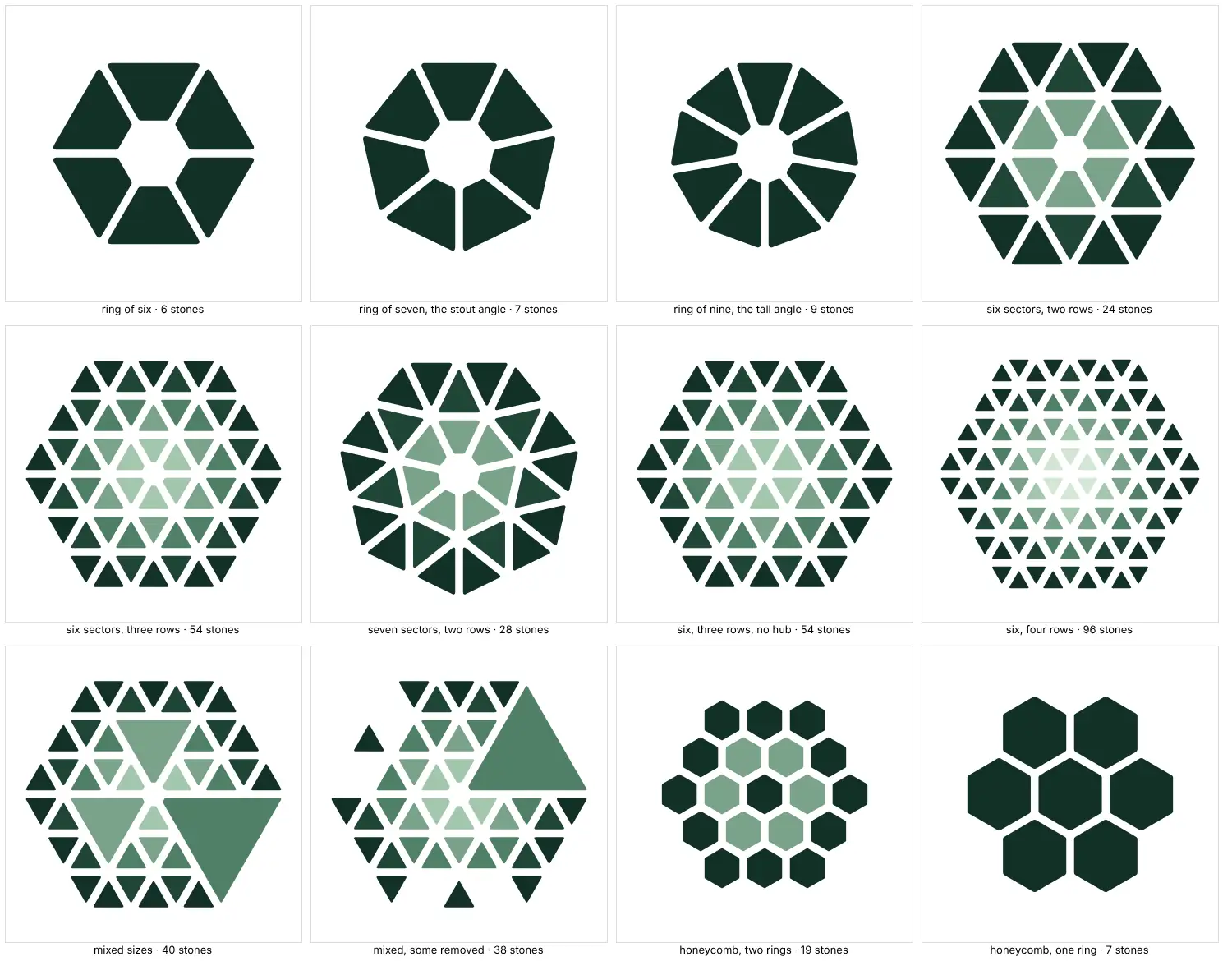
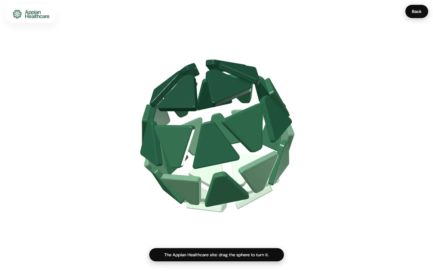
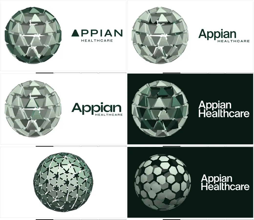
I drew the brand mark as 28 stout stone shapes in three rings, with an open centre. They're named for the road the company's offices sit on, Appian Way in Dublin and for the Via Appia.
A stone on its own isn't much. Stones together carry a load. That was the whole idea, and it tells a group of independent practices what they're part of.

Five rounds to green
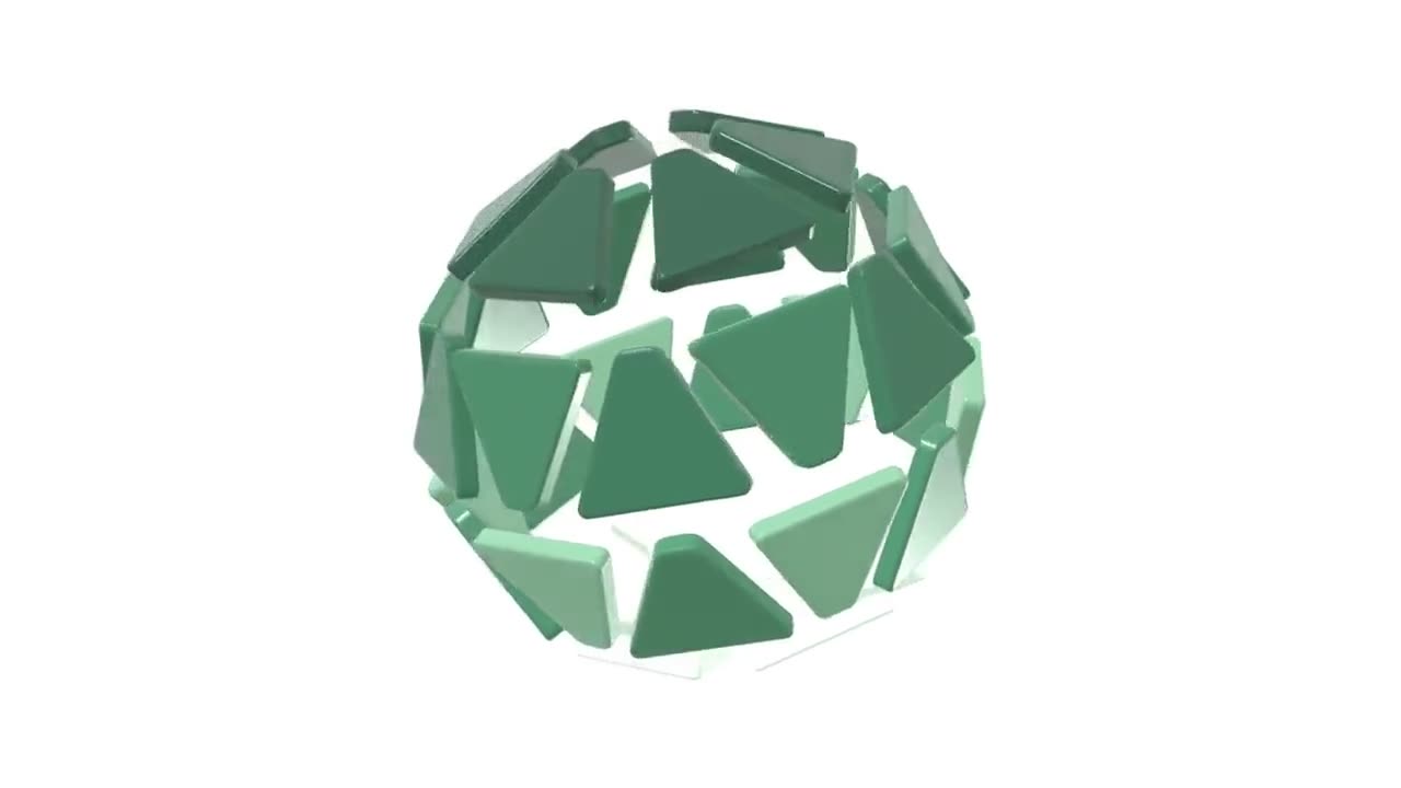
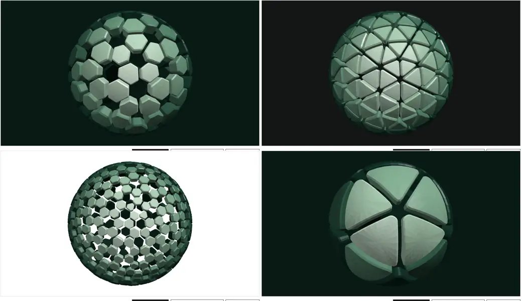
The client saw the work in rounds. Three routes first, then green and red, then a heart. The client moved away from an obvious heart, so I built a small tool to explore a sphere of stones instead, and drew a flat mark beside it.
In the fifth round we agreed on Appian Green, a deep green with lighter greens and a pale wash. The type is Figtree, the buttons are pills.
A website that builds itself
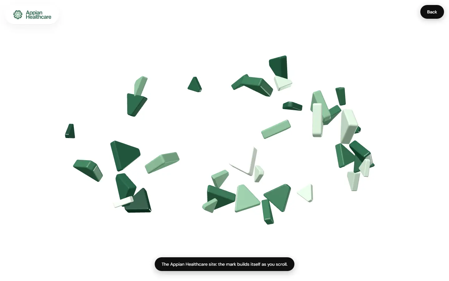
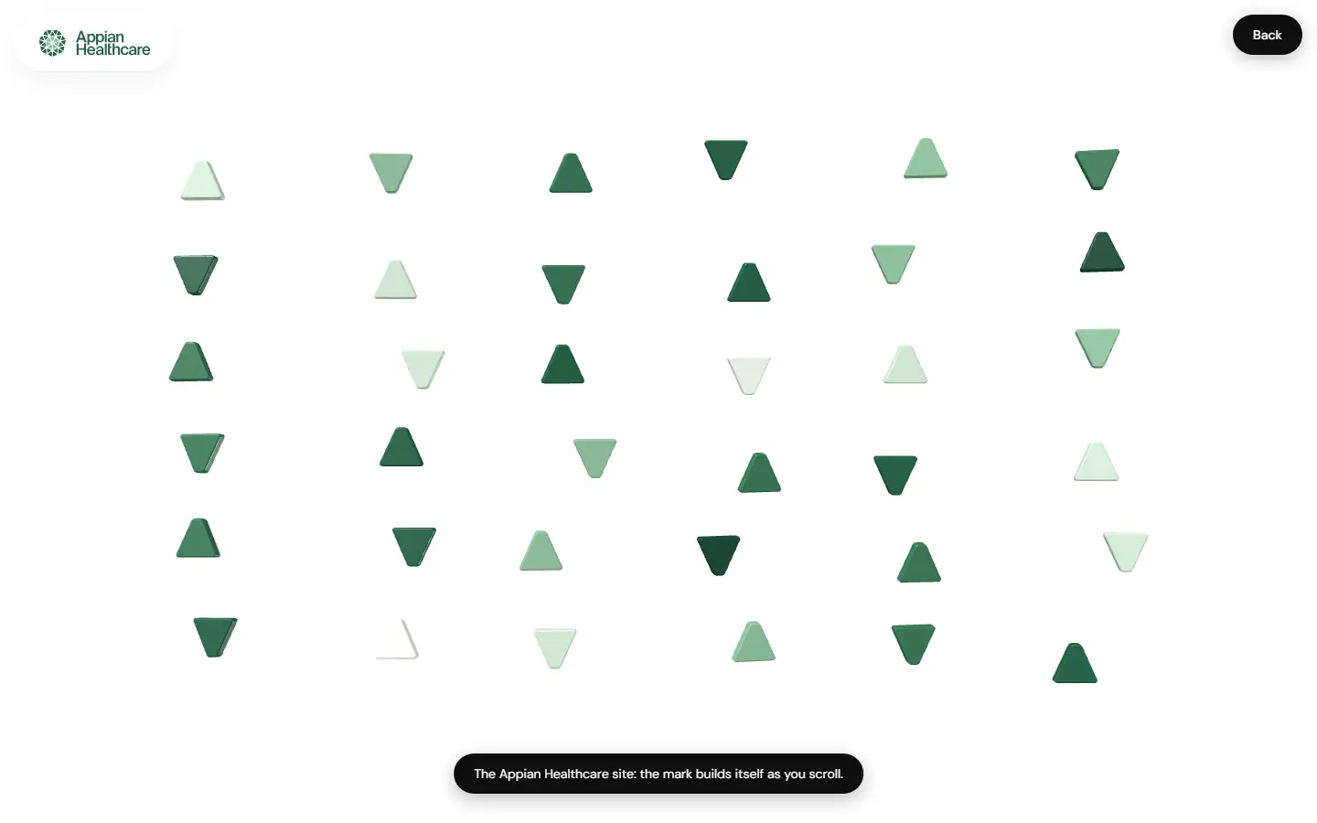
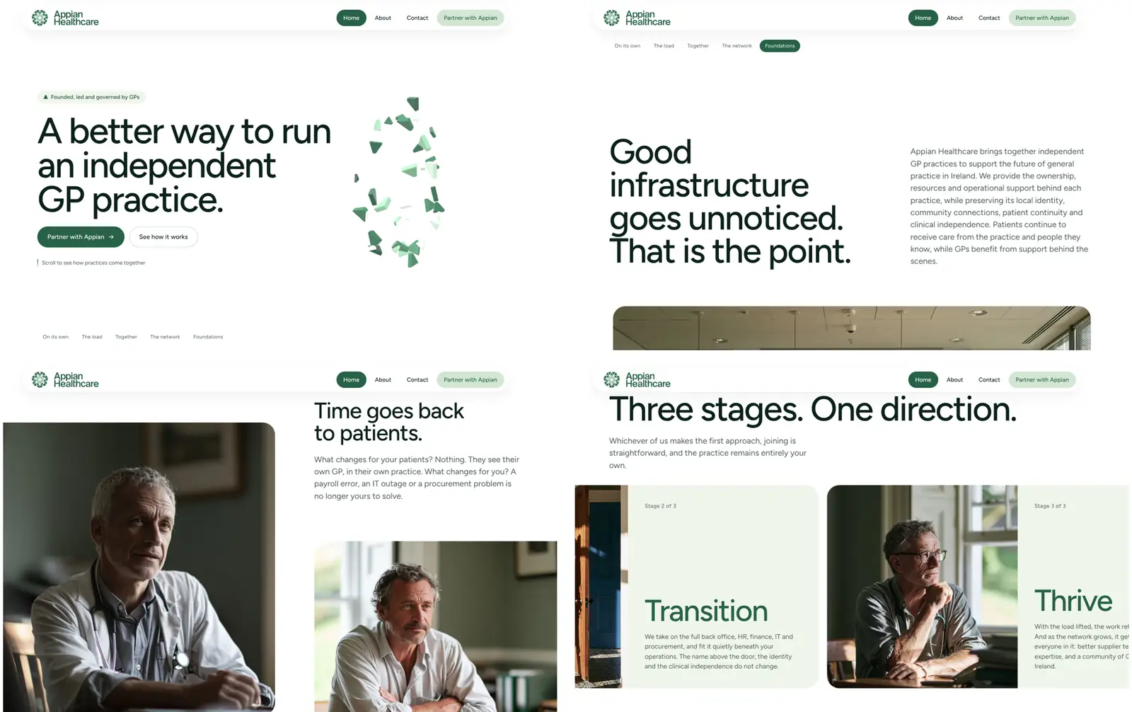
The website opens with the idea. Thirty-six stones of the mark's own shape drift about on their own, then fall into a grid, then come together as one sphere as you scroll. It's lit in real time, in the browser.
I wrote the copy direction, and directed the photography, which is AI-made and looks like small local practices, not hospitals. The enquiry form, the consent notice for analytics and a first draft of the privacy policy came too.
What it opened up
A brand with one argument, made without a word: separate stones become one thing you can lean on.
It also left me with the stone tools, which I can use again whenever a mark needs working out by hand.
What it took
- Identity and logos
- Design
- Typography
- Web and apps
- Interface design
- Real-time 3D
- Copywriting
- Art direction
- AI image and video